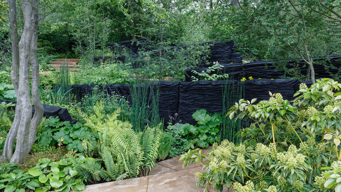
The M&G Garden by Andy Sturgeon
Green clouds of thick foliage pop against what looks like huge black rock formations in this award-winning design, but the slate-like forms are actually huge chunks of burnt oak. We love the visual effect, which is a technique Secret Gardens often employs in our designs; a dark backdrop – like a painted fence or wall – makes any foliage in front of it pop. But the particular material used here, the burnt timber, is one that would have particular resonance if used in an Australian setting, as bushfires are such an inevitable fact of life here and actually a crucial part of the natural cycle for many native plants.
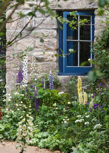
Photo Credit: The Welcome to Yorkshire Garden/The Chelsea Flower Show 2019
Welcome to Yorkshire by Mark Gregory
An almost twee picture of English country life, complete with meadow, canal and stone cottage, this gold medal-winning garden couldn’t be any more different from a typical Sydney landscape, but it offered unexpected inspiration for our design team, thanks to its use of colour. Many of our clients prefer a fairly neutral palette of greys, whites and, of course, shades of green, largely because of the work involved in maintaining a more colourful garden of perennials, but the effort is worth it. Here, flowering perennials are planted in blowsy clusters, lending the garden a welcome informality and softening the hard elements. It’s the sort of garden you’d love to spend time in, feeling the sun on your face and listening to the hum of bees. Even the blue windows show how introducing a bit of colour can really bring a garden to life.
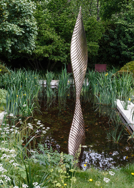
Photo Credit: The Savills and David Harber Garden/The Chelsea Flower Show 2019
The Morgan Stanley Garden by Chris Beardshaw
It would be a rare client who would be game to build a structure as avant-garde as this, but there’s no question it would be conversation starter! This daring design does offer some great ideas that we can take into a more everyday setting, however. We love the sculptural curved forms and the way the shape of the relaxation pod is echoed in perfect spheres of topiary. These rounded puffs of shrubbery both reflect the design of the built structure and also soften its contemporary design. We also love the materials palette of bronze, copper and dark wood, which gives welcome warmth to the space-age design.
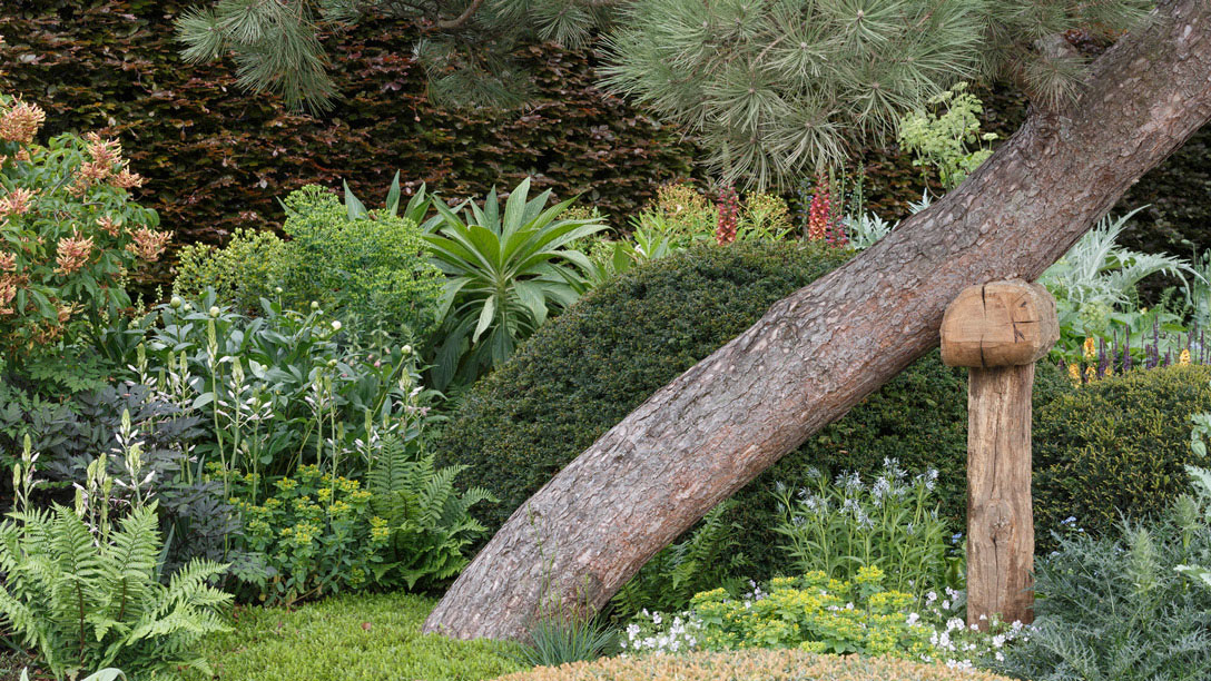
Photo Credit: The Morgan Stanley Garden/The Chelsea Flower Show 2019
The Savills and David Harber Garden by Andrew Duff
There’s much to love about this garden: the lines of paving that visually broaden the space, the blurred boundary of the wetland-style water feature. But we particularly love the elegant David Harber sculpture and the way its sinuous and sleek form contrasts with the meadow-like planting around it.
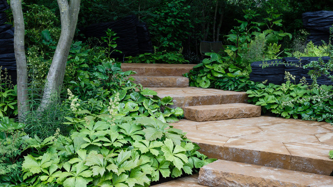
Photo Credit: The M&G Garden/The Chelsea Flower Show 2019
